 菲尼基科技



菲尼基科技参展CIBF2025完美收官!
1143菲尼基科技参展CIBF2025完美收官!感谢每一位莅临展台的伙伴,菲尼基将与上下游伙伴携手共建两轮换电新生态,守护亿万用户的安全出行!
查看全文全站搜索
Have you ever wondered how industrial teams pick the final color for battery swap cabinets? It’s never just about what looks good.
Color selection is far more than aesthetics. For outdoor operational equipment like battery swap cabinets, color is an integral part of product definition.
We used the exact same cabinet structure and only adjusted coating finishes to develop three schemes. Coloring is never a cosmetic final touch. It directly impacts rider recognition, site compatibility, and how the hardware looks after years of outdoor exposure and ageing.
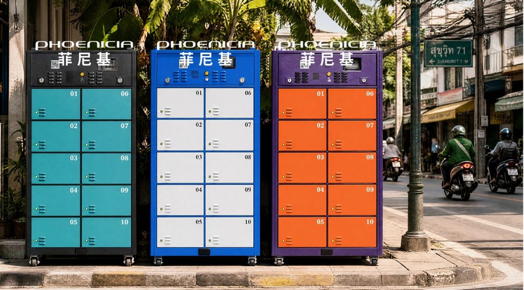
🟢 A|Bright Cyan × Charcoal BlackBright cyan compartments, charcoal-black structural frames, with fluorescent yellow number marking. Rare on the market. Strong light-dark contrast helps riders quickly spot empty bays. Optimized for operational efficiency.
🔵 B|Electric Blue × Off-whiteElectric blue frame, white compartments with fluorescent green accent strips. Classic commercial look, ideal for malls and office districts, prioritizing visual harmony with surrounding environments.
🟣 C|Deep Purple × Fluorescent OrangeDeep purple outer shell, light purple compartments, fluorescent orange identification marks. Best nighttime visibility among the three. However, dark casing carries higher solar heat load. Thermal performance must be verified once this palette is selected.
These three schemes are just outcomes. Color design does not start with picking pretty shades. We first map hard constraints, then evaluate stakeholder requirements, on-site performance, manufacturing feasibility and long-term lifecycle behaviour.
1. Brand Guidelines Come FirstBrand identity is the top hard constraint.
For operator projects, color is usually governed by the operator’s VI system rather than on-site preference. A designer’s job is not simply to create attractive colors, but to plan color blocking within the existing brand framework.
We can use a single brand tone and rely on shape and numbering for identification, or split colors: brand tones on structural frames, light shades on compartments, balancing brand visibility and operational usability.
Mature brands leave little room for custom color freedom. For newly established brands, color can act as a core recognition asset.
Good color design is not about inventing a nicer shade; it is about finding a workable balance within brand and manufacturing limits.
2. Tier Your Client RequirementsClient expectations generally fall into three categories: fixed color code, defined brand color without hardware styling rules, or no clear visual requirements.
The third case does not mean we can simplify design. The real-world impacts of outdoor color do not disappear just because the client has not specified them.
A practical approach is to build a field-proven baseline palette. Use it by default unless customisation is requested, so we avoid designing from scratch every time.
The value of a standard design is not convenience — it turns verified performance into the default.
3. Who Is the Cabinet For? Balance Visual Needs of Three GroupsAfter brand and client constraints are clarified, we look at end users. A swap cabinet serves riders, site landlords and passers-by, with separate goals: empty bay recognition, site approval, and brand exposure.
Your priority sets the direction. Prioritise operations? Boost contrast. Prioritise site acceptance? Blend into surroundings. Prioritise branding? Use higher saturation.
Scheme A leans to operations, B to site compatibility, C to brand visibility. Define your priority first, and you get your evaluation benchmark.
Color may look like the last production step, but it is one of the earliest decisions to make.
4. Two Visual Modes: Daytime & NighttimeRecognition by day relies on brightness and hue difference. Night recognition depends on even strip lighting and consistent luminance.
Many prototypes look good in daylight but turn into washed-out glowing panels at night, losing all clear markers.
Color evaluation cannot be separated from lighting review. Dark cabinets deliver sharp contrast for night marking yet trap more solar heat. Light finishes stay clean by day but lack depth after dark without well-designed lighting. Color and lighting must be assessed together.
We judge color contrast by day, luminous clarity by night. Never approve colors without reviewing them with the intended lighting.
5. Mass Production Consistency: Repeatable Color at ScaleHigh-saturation and fluorescent shades are extremely sensitive to base material and spray processes. Color matching can be controlled within one batch, but discrepancies accumulate across factories, production runs and replacement spare parts.
For brand colors, color drift equals broken brand recognition. At sampling stage, lock three points: who keeps the master color standard, acceptable color tolerance, and rules for re-coloring replacement components.
For bold high-saturation colors, mismatched spare parts are often more noticeable than physical scratches and wear.
6. Predict Long-term Ageing BehaviourUV exposure is the common enemy of all outdoor hardware. Different colors fade differently: Light shades turn yellow, cyan shifts toward grey-green, deep purple gradually desaturates to grey, and fluorescent tones lose saturation fastest.
Do not judge a palette only by brand-new prototypes. Reference ageing test data to confirm acceptable appearance across a 5-year lifecycle.
Low-saturation finishes just “look worn” as they age. Faded high-saturation colors look “dirty”. These create very different brand impressions.
There is rarely a universally perfect color scheme for industrial equipment. Only trade-offs under defined constraints.
Brand rules, end-user efficiency, site restrictions, manufacturability and outdoor ageing all shift the answer. A beautiful prototype is only the starting point. A qualified palette stays predictable through sunshine, day-night cycles and component replacements once deployed on the street.
For these multi-faceted visual trade-offs, Phoenicia delivers professional advice rooted in field experience, manufacturing know-how and full-lifecycle thinking.
Beauty is a result, not the target. Color must serve users, sites, mass production and long-term ageing performance.

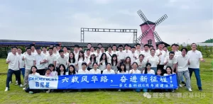
嘿!家人们,深圳市菲尼基科技有限公司六周岁啦! 六年前,怀揣着为两轮电动车出行 “大变样” 的梦想,菲尼基勇敢踏上征程。创业之路泥泞艰难,但凭借着对行业的深度理解,不服输的拼搏精神与卓越的创新思维,我们一路砥砺前行。 庆六周年活动现场 坚持自主研发是我们...
查看全文

近日,菲尼基科技先后与香港大学、香港理工大学展开深度互动,从硕士论文项目合作到师生参访交流,以产学研协同创新,助力两轮换电行业的技术升级与人才培养。
查看全文
提交产品咨询
我们将尽快联系您